

Data-driven operations is the management practice of making operational decisions by default with timely, evidence-backed metrics. Not dashboards. Not reports. The habit of asking “what does the evidence say?” before committing to action, scaled to the size of the bet. When that question is normal and welcome in your meetings, a data-driven culture exists. When it is not, no amount of tooling will change behavior.
You know the program is starting to work when decisions are repeatable and visible, and cycle times on a chosen workflow are measurably shorter. Here is a five-item checklist you can act on this week:
-
Pick one recurring decision. Choose a high-frequency, weekly operational choice (overtime approvals, ticket prioritization, reorder triggers) that currently runs on gut feel.
-
Agree on a single metric definition. Write it in plain English: what it measures, how it is calculated, and where the data comes from. One sentence.
-
Instrument the data. Tag events, pull the source, or run a two-week manual tagging exercise. Imperfect data now beats perfect data in six months.
-
Assign an owner. One person is responsible for the metric’s accuracy. Not a team. One person.
-
Run the first evidence-based decision cycle. Use the number. Document the outcome. Share it with the team.
That sequence produces a visible win inside two weeks and builds more trust than a full dashboard rollout.
Table of Contents
-
What measurable outcomes can you expect from data-driven operations?
-
The six pillars that hold a data-driven operations program together
-
How to build your implementation roadmap from day one to 12 months
-
What does the right data architecture look like for operational use cases?
-
How do you build governance that operations teams will actually follow?
-
What are the most common failure modes in data-driven programs?
-
How do you upskill an operations team to actually use data tools?
-
The gap between what data-driven operations promises and what actually matters
-
POW IT UP turns your first instrumented decision into a working system
What measurable outcomes can you expect from data-driven operations?
The business case for analytics-driven management is not abstract. Operations leaders who have instrumented even a single decision workflow consistently report faster cycle times, lower rework rates, and reduced cost per transaction. The academic evidence supports this: empirical research finds that sensing and analytics capabilities directly improve operational performance, and a data-driven culture strengthens that effect further.

The value flows through four primary streams. Faster decisions reduce the cost of delay. Lower operating cost comes from eliminating rework and manual reconciliation. Improved reliability and throughput follow from early problem detection. Reduced risk comes from making more decisions reversible before they become irreversible.
| Outcome Area | Example Metric | Directional Target for a Pilot |
|---|---|---|
| Decision speed | Time to decision for a targeted workflow | 10–30% reduction in the first 90 days |
| Operating cost | Cost per transaction (manual vs. automated) | Measurable reduction after first automation |
| Reliability | Mean time to detect (MTTD) an ops issue | Shift from reactive to same-day detection |
| Throughput | On-time completion rate for a key process | Baseline, then 5–15% improvement per quarter |
| Risk / rework | % of decisions reversed or corrected post-action | Track and reduce over 6 months |
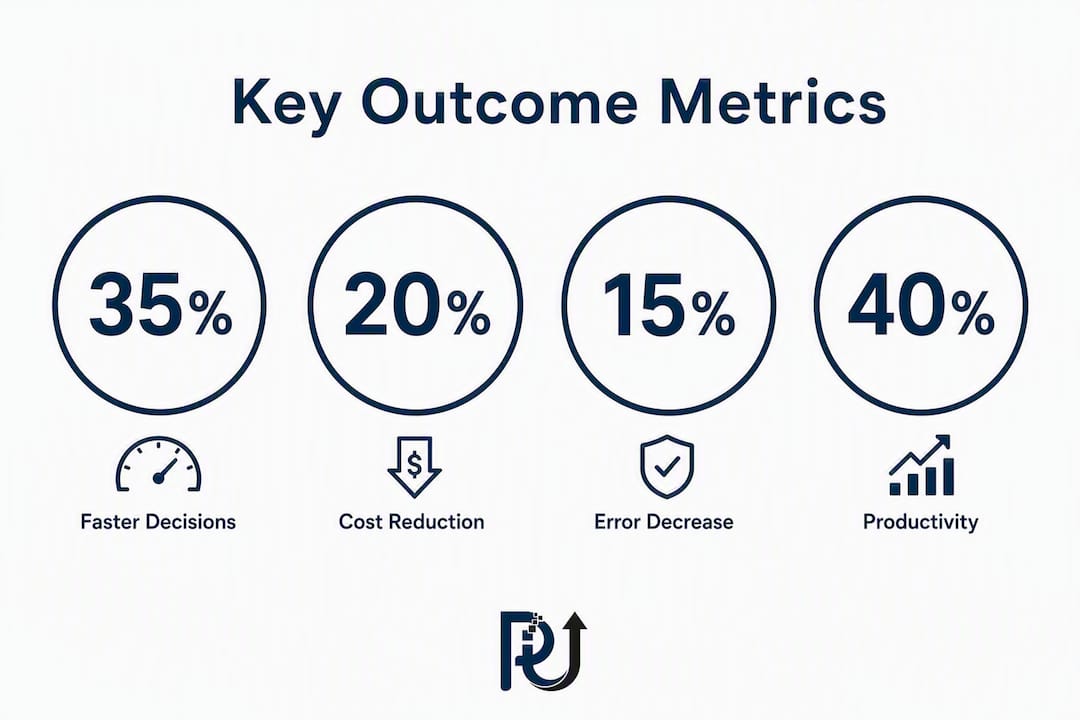
Set your pilot target before you start. A measurable reduction in time to decision for one targeted workflow is a realistic and defensible goal for a 90-day pilot. That number gives you a business case, a success criterion, and a conversation starter with your CFO.
The six pillars that hold a data-driven operations program together
A durable framework for data-informed business strategies has six pillars. Think of them as capability gaps to assess, not as a sequential checklist. Most operations teams are strong in one or two and weak in the rest.
1. Strategy and outcomes. Every metric must trace back to a business outcome. If you cannot explain why a metric matters in one sentence, it should not be on a dashboard.
2. Operating culture and decision habits. Treating operations as a learning system means instrumenting workflows, making performance visible, and giving teams the ability to improve work while performing it. Culture is the hardest pillar to build and the easiest to destroy with a bad metric.
3. Instrumentation and data pipelines. Raw data collection, event tagging, and source system access. Without this, everything else is theoretical.
4. Analytics and reporting. Transformation, aggregation, and the dashboards or alerts that surface insights at the right time. The goal is Monday morning decisions, not quarterly slide decks.
5. Data governance and ownership. Who defines each metric, who owns its accuracy, and what happens when two teams disagree on a number. Governance sounds bureaucratic; without it, metric mistrust kills adoption.
6. Skills and enablement. The people who can read a metric, question its source, and act on it. This is not just a data team problem. Operations managers need enough fluency to challenge a number.
A minimal RACI for a pilot program looks like this:
-
Operations owner: defines the decision, sets the target, acts on the metric.
-
Analytics engineer: builds and maintains the pipeline and metric definition.
-
Data steward: verifies data quality and documents lineage.
-
Product or IT: manages source system access and infrastructure.
Pro Tip: Scale evidence to the size of the bet. Reversible decisions (staffing adjustments, reorder quantities) need light, fast evidence. Irreversible decisions (facility closures, platform migrations) deserve deep analysis. Treating every decision like a capital allocation is how analysis paralysis starts.
How to build your implementation roadmap from day one to 12 months
Operational readiness must start on day one to avoid losing or producing irrelevant project data. Align data collection requirements with operational needs before the first sprint, not after the first dashboard is built.
| Phase | Milestones | Typical Effort | Expected Business Impact |
|---|---|---|---|
| Day 1 readiness | Lock metric definitions, assign owners, confirm source system access | 1–2 FTE weeks | Prevents costly retrofits; sets governance baseline |
| 30 days | Instrument one decision, publish a working metric, run first evidence-based cycle | 2–4 FTE weeks | Visible cultural proof point; baseline established |
| 90 days | Automate data flows, build operational dashboard, add basic alerting | 4–8 FTE weeks (engineering) | Repeatable decisions; early cost and throughput signals |
| 6–12 months | Scaled decision catalog, governance and training, prioritized automation | Ongoing; 1 FTE + tooling | Measurable cost reduction, throughput gains, risk reduction |
Day one checklist. Before anything else: document the metric definition in writing, confirm who owns it, verify you have read access to the source data, and identify the first decision you will instrument. Four items. If any one is missing, the program stalls at week three.
30-day quick wins. Pick the single highest-frequency decision in your operation. Tag the relevant events manually if you have to. Publish the first number, even if it is rough. Run the decision with the evidence. Document what changed. That story is your internal case study.
90-day goals. Automate the data flow that was manual in week two. Add a second metric. Build a simple dashboard with one alert threshold. Run a small experiment: change one variable, measure the outcome, share the result. By day 90, your team should be asking “what does the data show?” without being prompted.
6–12 month outcomes. A decision catalog that lists every instrumented decision, its metric, its owner, and its improvement history. Governance documentation. A training program for operations managers. Prioritized automation candidates with cost-benefit estimates.
What does the right data architecture look like for operational use cases?
The architecture question is not which tool to buy. It is which layers you need and how they connect. Operational analytics use cases like predictive maintenance, demand forecasting, workforce planning, and supply chain optimization each have different latency requirements, but they all share the same five-layer structure.
Layer 1: Sources and ingestion. ERP systems, IoT sensors, CRM platforms, log files, and external signals. The rule is simple: every metric has one authoritative source. Never blend two sources into a metric without documenting the join logic.
Layer 2: Transformation and metrics layer. ETL or ELT pipelines (tools like dbt, Apache Airflow, or Fivetran) that clean, join, and aggregate raw data into metric-ready tables. This is where most data quality problems are caught or created.
Layer 3: Metrics store. A single, versioned repository of metric definitions and their computed values. Tools like Cube or a lightweight semantic layer in your BI platform serve this role. The metrics store is what prevents two teams from computing “on-time delivery” differently.
Layer 4: Operational dashboards and alerts. Platforms like Tableau, Power BI, or Looker surface metrics to operations managers. The design principle: one primary metric per decision, with a counter-metric to prevent gaming. Alert thresholds matter more than visualizations.
Layer 5: Automation and agents. Automating recurring transactional workflows closes the loop between insight and action. This is where AI agents and workflow orchestration tools execute decisions at scale.
For cloud analytics patterns and managed services, the architecture choices shift toward managed pipelines and serverless compute, which reduces engineering overhead for smaller operations teams.
| Use Case | Real-Time (sub-minute) | Batch (hourly/daily) | Recommended Pattern |
|---|---|---|---|
| Equipment fault detection | Required | Insufficient | Streaming (Kafka, Kinesis) + alerting |
| Demand forecasting | Not needed | Sufficient | Nightly batch + dashboard refresh |
| Workforce scheduling | Near-real-time (15 min) | Insufficient | Micro-batch or event-driven |
| Invoice and document processing | Not needed | Sufficient | Batch ETL + document intelligence |
| Supply chain exception alerts | Required | Insufficient | Streaming + threshold-based alerting |
The design rule that prevents the most arguments: every metric has a single source of truth, a named owner, and observable lineage. When a number looks wrong, you need to trace it back to its source in under five minutes. If you cannot, the metric will not be trusted.
How do you build governance that operations teams will actually follow?
A metric catalog with plain-English definitions, a single owner, and a documented source prevents more arguments than any visualization tool. Governance does not need to be heavy. It needs to be consistent.
The minimal governance model for an operations pilot has four components:
| Component | What It Contains | Who Maintains It |
|---|---|---|
| Metric catalog | Name, definition, formula, source, owner, last verified date | Analytics engineer + metric owner |
| Ownership register | One named owner per metric, escalation path for disputes | Operations lead |
| Lineage notes | Source system, transformation logic, known gaps or caveats | Data steward |
| QA checklist | Verification steps before a metric is published to a wider audience | Data steward |
QA checklist before publishing a metric:
-
Source confirmed and access documented
-
Definition written in plain English and reviewed by the operations owner
-
At least two weeks of historical data validated against a known baseline
-
Counter-metric identified to prevent single-metric gaming
-
Alert threshold set and tested
On compliance: US operations handling personally identifiable information (PII) must apply role-based access controls to metric pipelines and dashboards, consistent with applicable federal and state privacy requirements. Lineage documentation supports audit readiness. These are not optional steps for regulated industries.
A governance model that requires a committee approval for every new metric will be abandoned within 90 days. The goal is a living document, not a policy manual. Keep it short, keep it current, and make the metric owner responsible for its accuracy.
How do you choose KPIs that actually change behavior?
A KPI that does not change a decision is a decoration. The test for a good operational KPI is simple: if the number moves, does someone do something different? If the answer is no, the metric is not operational.
The KPI selection process:
-
Map to an outcome. Start with the business result (lower cost, faster throughput, fewer defects) and work backward to the metric that predicts it.
-
Check for manipulability. Every metric can be gamed. Pair each primary KPI with a counter-metric that catches the most obvious gaming behavior. On-time delivery paired with order cancellation rate is a classic example.
-
Set a realistic SLO. A Service Level Objective for operations might be “95% of orders processed within 24 hours” or “mean time to action on a flagged exception under 4 hours.” The target must be achievable in the current state plus a stretch, not aspirational fiction.
-
Define the experiment. Before changing a process, write a hypothesis: “If we change X, metric Y will move by Z within N weeks.” Set guardrails (what would cause you to stop the experiment) and rollback criteria.
-
Review the loop. Weekly for pilot metrics, monthly for scaled ones. The review question is not “is the number good?” It is “did the decision we made last week produce the expected outcome?”
For setting up analytics to track business growth, the same principle applies: the metric must be tied to a decision, not just a trend line.
KPI workshop template (one page):
-
Decision being instrumented:
-
Business outcome it supports:
-
Primary metric (name, formula, source):
-
Counter-metric:
-
SLO target:
-
Owner:
-
Review cadence:
High-performing organizations treat operations as a learning system: instrument workflows, reveal problems early, and blend metrics with everyday improvement rather than waiting for quarterly reviews.
What are the most common failure modes in data-driven programs?
Most data-driven operations programs do not fail because of bad technology. They fail because of predictable cultural and structural problems that were visible early and ignored.
The five most common failure modes, and what to do about each:
Analysis paralysis. Teams wait for more data before making a decision that needed to be made last week. The fix: scale evidence to the size of the bet. Reversible decisions do not need statistical significance. Make the call, measure the outcome, adjust.
Siloed data. Operations, finance, and product each have their own version of the same metric. The fix: a shared metric catalog with one authoritative definition per metric. Disagreements about numbers are almost always disagreements about definitions.
Wrong ownership. A metric is owned by the analytics team, not the operations team that acts on it. The fix: the person who makes the decision owns the metric. The analytics team supports; the operations owner is accountable.
Tool sprawl. Five dashboards, three data sources, and no one knows which number is current. The fix: instrument one decision at a time. Add a tool only when the current setup cannot support the next decision. The operational efficiency guide covers this pattern in detail.
Disconnect between project data and operations needs. A consistent failure mode is the gap between what a project team collects during development and what operations actually needs to run the system. Require operational data requirements during project scoping, not after go-live.
Red flags to watch for:
-
Meetings where someone says “I don’t trust that number” and no one investigates why
-
Dashboards that are updated before quarterly reviews and ignored the rest of the time
-
Metrics with no named owner
-
A decision that has been “waiting for more data” for more than two weeks
When you see these signals, pause and re-baseline. Pushing a dashboard harder into a culture that does not trust the numbers makes the problem worse.
How POW IT UP implements data-driven operations for clients
POW IT UP maps its engagement model directly to the roadmap phases described above. The approach is not to sell a platform and leave. It is to instrument one decision, deliver measurable results, and build the internal capability to scale.
Engagement timeline:
-
Pilot (weeks 1–4): Scoping, metric definition, source system access, and instrumentation of one high-frequency decision workflow. Deliverable: a working metric, a data pipeline, and a first evidence-based decision cycle.
-
Build (weeks 5–12): Automated data flows, operational dashboard with alerting, and a second instrumented decision. Deliverable: a repeatable decision loop and a baseline for cost and throughput improvement.
-
Scale (months 4–12): Decision catalog, governance documentation, training for operations managers, and prioritized automation agents. Deliverable: a scaled program with measurable cost reduction and throughput gains.
Core deliverables across an engagement:
-
Metric catalog with plain-English definitions and ownership register
-
Instrumented data pipelines (ETL/ELT, event tagging, source system integration)
-
Operational dashboards and threshold-based alerting
-
Automation agents for high-volume transactional workflows
-
DocuPOW for document reading, validation, and intelligent extraction
-
AuraPOW for portfolio monitoring and client health analytics
-
Training sessions for operations managers on metric fluency and decision habits
Sample outcomes from POW IT UP engagements:
-
Document processing workflows instrumented with DocuPOW show significant reductions in manual review time per document batch, with validation errors caught before they reach downstream systems.
-
AuraPOW deployments give portfolio and operations teams a single view of client health metrics, replacing manual spreadsheet consolidation with automated, real-time signals.
-
Custom AI agent builds for transactional operations allow teams to scale processing volume without adding headcount, with the automation handling exception routing and escalation logic.
The pilot structure is designed to produce a visible, measurable result within 30 days. That result becomes the internal business case for the next phase.
How do you upskill an operations team to actually use data tools?
Training is where most data programs quietly die. The analytics team builds the dashboard. The operations team glances at it once, does not understand what it is telling them, and goes back to the spreadsheet. The problem is not motivation. It is that the training was designed for data analysts, not operations managers.
Effective upskilling for operations teams has three layers.
Layer 1: Metric fluency, not tool training. Operations managers do not need to know how to write SQL. They need to know how to read a metric, question its source, and recognize when a number looks wrong. A two-hour workshop on “how to challenge a metric” is more valuable than a four-hour Tableau certification for most operations roles.
Layer 2: Decision habit coaching. The goal is to make “what does the evidence say?” a normal question in every operational meeting. This is a behavioral change, not a technical one. Adopting AI and data tools in service businesses requires the same cultural shift: the tool is the easy part; the habit is the hard part.
Layer 3: Role-specific tool training. Once the habit is established, targeted training on the specific tools the team uses (Power BI, Looker, a custom dashboard) makes sense. Keep it short, keep it practical, and tie every exercise to a real decision the team makes.
Practical upskilling approaches:
-
Embedded learning: pair an analytics engineer with an operations manager for the first 30 days of a new metric. The engineer explains the data; the manager explains the decision. Both learn.
-
Decision reviews: a weekly 15-minute review of one instrumented decision, focused on “what did the evidence say, what did we do, and what happened?” This builds the habit faster than any formal training.
-
Metric office hours: a standing slot where operations managers can bring a number they do not understand and get a plain-English explanation. Low cost, high trust-building value.
-
Tiered certification paths: for organizations that want a formal structure, tools like Coursera, LinkedIn Learning, and Google’s Data Analytics Certificate provide accessible foundations. The key is to require application to a real work decision, not just course completion.
The service operations automation checklist is a practical starting point for managers who want a structured path from manual processes to instrumented, automated workflows.
Key Takeaways
Data-driven operations succeeds when the habit of asking “what does the evidence say?” is built into every recurring decision, backed by a single authoritative metric with a named owner.
| Point | Details |
|---|---|
| Start with one decision | Instrument one high-frequency, recurring decision before building any dashboard or buying any tool. |
| Make metrics authoritative | Every metric needs a plain-English definition, a single owner, and a documented source to prevent mistrust. |
| Scale evidence to the bet | Reversible decisions need light, fast evidence; irreversible ones deserve deep analysis before committing. |
| Governance must be light | A metric catalog and ownership register maintained as living documents beats a policy manual no one reads. |
| POW IT UP pilots in 30 days | POW IT UP instruments one decision, delivers a working metric and pipeline, and produces measurable results within a 30-day pilot engagement. |
The gap between what data-driven operations promises and what actually matters
Most organizations approach this wrong. They buy a BI platform, hire a data analyst, and wait for insights to appear. When the insights do not change behavior, they blame the tool or the analyst. The real problem is that they skipped the hardest step: changing the decision habit before changing the technology.
The single most reliable predictor of a data-driven program’s success is not the sophistication of the analytics stack. It is whether the operations leader asks “what does the evidence say?” in the first meeting after the first metric goes live. That question, asked once in public, does more for adoption than six months of training.
What most articles on this topic underestimate is the role of counter-metrics. Every operational KPI has a shadow: the thing that gets worse when you optimize the primary number. On-time delivery improves when you cancel hard orders. Ticket resolution speed improves when you close tickets without solving the problem. The counter-metric is not a nice-to-have. It is the mechanism that keeps the primary metric honest.
The other thing practitioners rarely say out loud: the first metric you instrument will probably be wrong. The definition will be off, the source will have gaps, or the number will not actually predict the outcome you care about. That is fine. The point of the first 30 days is not to get the metric right. It is to build the habit of using one. You fix the metric in month two.
POW IT UP turns your first instrumented decision into a working system
The hardest part of building analytics-driven management is not the technology. It is getting from “we should be more data-driven” to a working metric, a named owner, and a decision that actually changed because of a number. Most operations teams stall somewhere between those two points.
POW IT UP closes that gap. As a custom AI integration and automation firm, POW IT UP scopes, instruments, and delivers a working data pipeline and operational dashboard for one decision workflow in 30 days. No six-month implementation. No platform lock-in. A concrete result you can show your leadership team.
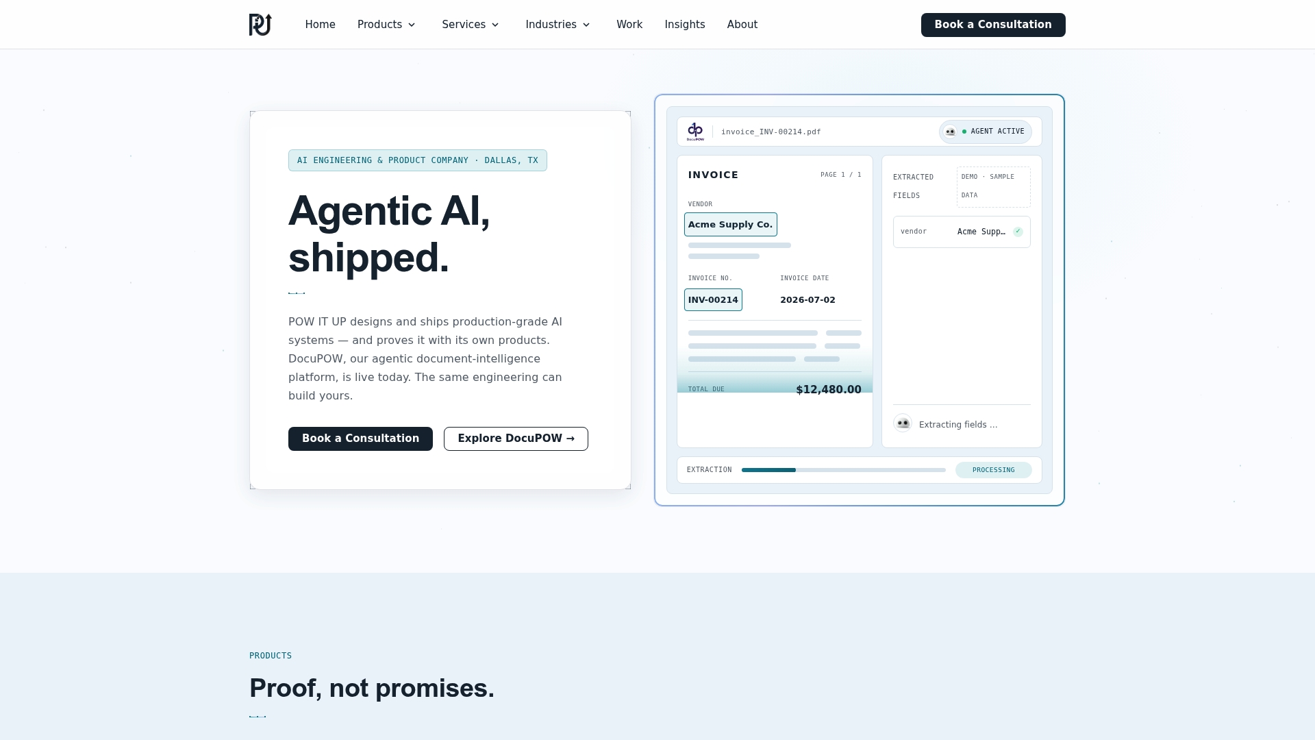
DocuPOW handles document intelligence and validation. AuraPOW gives portfolio and operations teams real-time client health signals. Custom AI agents automate the transactional workflows that eat your team’s time. And the engagement is structured to build your internal capability, not just deliver a dashboard.
If you are ready to instrument your first decision and produce a measurable result, request a pilot engagement or review the business automation agency model to understand how the engagement works before you commit.
Useful sources
The following sources informed this playbook and are worth consulting directly for deeper reading on architecture patterns, governance templates, and the academic evidence base.
| Source | What It Covers |
|---|---|
| Data-Driven Operations: A COO’s Practical Guide | Decision habits, cultural proof points, and the instrument-one-decision-first approach |
| Hatch: Turning Information into Action | Operational readiness, metric catalogs, and governance for project-to-operations transitions |
| Maggie Sun: Thrive in the Digital Age | Operations as a learning system; workflow visibility and continuous improvement |
| Springer: Analytics Capability and Ops Performance | Empirical research on sensing and analytics capabilities and their effect on operational outcomes |
| Sprinkle Data: Analytics in Operations Management | Use case examples: predictive maintenance, demand forecasting, workforce planning |
| HBR: Why Is It So Hard to Become a Data-Driven Company? | Cultural and organizational barriers to data adoption; why technology alone does not work |
| INFORMS: Data Analytics in Operations Management | Academic review of data analytics applications across supply chain, service, and manufacturing operations |
| POW IT UP: AI Automates Recurring Deliverables | How AI agents and automation close the loop between insight and operational action |
For architecture patterns and workflow scaling, the Alytics guide on designing SaaS workflows that scale covers orchestration and pipeline design in practical terms.
FAQ
What are some examples of data-driven operations?
Predictive maintenance using sensor data, demand forecasting from sales and external signals, workforce scheduling from historical patterns, and automated invoice validation are all common examples. Each involves instrumenting a recurring operational decision with a real-time or batch data feed and acting on the output.
Why is it so hard to become a data-driven company?
The core barrier is cultural, not technical: most organizations have data but have not built the habit of using it before making decisions. Technology without a decision habit produces dashboards that decorate quarterly reviews rather than change Monday morning behavior.
What does a data-driven operations example look like in practice?
A distribution center that instruments its daily reorder decision with a live inventory metric, assigns one owner to that metric, and runs a weekly review of outcomes is a practical example. The decision is recurring, the metric is authoritative, and the loop closes within days rather than quarters.
What examples of data-driven companies exist?
Companies like Amazon, UPS, and Delta Air Lines are frequently cited for using operational analytics at scale, covering demand forecasting, route optimization, and maintenance scheduling respectively. The same principles apply at any scale: instrument a recurring decision, assign ownership, and act on the evidence.
How does POW IT UP support data-driven operations programs?
POW IT UP instruments one decision workflow in a 30-day pilot, delivering a working metric, data pipeline, and operational dashboard. DocuPOW handles document intelligence, AuraPOW provides portfolio and client health analytics, and custom AI agents automate high-volume transactional processes.